Have you ever looked at a website and thought that it’s the best interface you’ve ever seen? These days, it’s a luxury. Well-promoted and frequently visited websites have so much to handle that they cannot cater to rising users’ needs. They have to sacrifice one thing or another, making the user experience a secondary priority. Yet, other applications and websites take the opposite approach, trying to win the hearts of their users.
The Awwwards platform has tons of your potential favorites. Some of them offer new learning opportunities, and others show how diverse the world of web development is in terms of the technologies that can be implemented. The Awwwards choices might serve as the source of inspiration for those interested in website development. To get a sense of it, let’s look through some amazing projects.
Ocean School

Source: oceanschool.nfb.ca
As the website’s hero section states, “this is a classroom.” If you look closer, you will see that it’s not the typical school we’re used to. It’s not just an institution website; it’s an online school with an immersive experience!
On the website, you can find whole module guides that include theory and interesting tasks for students who would like to learn how to preserve the ocean ecosystem.
Just imagine it: you may not even need to look for a quality essay writer on websites such as essayhub.com, listen to boring lectures, and have sleepless nights preparing for an exam but still gain valuable skills. The Ocean Frontier Institute and the National Film Board of Canada have done an excellent job to help you with that!
Ocean School has a Site Of the Day award and a 7.24 rate. The animations are astonishing; 3D effects and a 360-degree view allow visitors to interact with the website and have a great user experience. So, how have developers managed to achieve the wow effect?
Let’s look at the tech stack they used:
- Craft CMS;
- React.js;
- WebGL.
Academy of Art University (US)

Source: en.wikipedia.org
The academy’s website design was meant to be completely reinvented to reflect its culture and values. It must’ve been a long haul, but it seems like the developers managed to do that. The project received an honorable mention and has been nominated in different categories.
The website doesn’t have many colors when it comes to the basic elements of the interface. White background, an accent color, and a neat font are all you need to create a minimalistic yet impressive website. Of course, when it comes to art, one should use more visuals, just like the academy website does. Users get to enjoy the perfect combination of functionality and aesthetics – an eye-catcher for aspiring artists.
The tech stack used:
- WordPress;
- React.js;
- CSS3;
- Nginx;
- PHP.
Health By Habit

Source: byhabit.com
Although this is an online shop, it has quite an unusual interface. First of all, it doesn’t glitch and is rich in animated elements. Second of all, it is well-thought-out and has a smooth flow. What’s most important, it combines fluid and adaptive design, which makes the website fully responsive to different gadgets. Given all the non-trivial features and great user experience, Health By Habit has become a magnet for potential customers.
Tech stack used:
- Vue.js;
- Nuxt.js;
- CSS3;
- GSAP Animation.
WTF Is Data Science?

Source: cssdesignawards.com
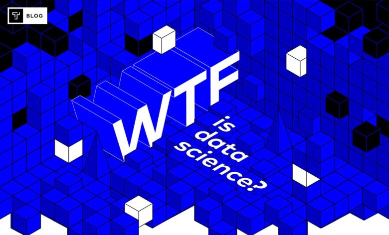
If you have ever wondered what is meant by big data and data science, this website with the Site Of the Day award can explain it to you in layman’s terms.
As you scroll down the website, the interface doesn’t let you get distracted using attention grabbers like voluminous 3D-effect elements, graphics, animated live statistics, and visual explanations. At the same time, you don’t feel overloaded with information – it’s provided in bearable chunks and is easily perceived. You just don’t want to leave the website.
Tech stack used:
- React.js (with Webpack under the hood);
- Node.js, Express;
- Cloudflare;
- jQuery.
Dark: Official Netflix Guide

Source: unsplash.com
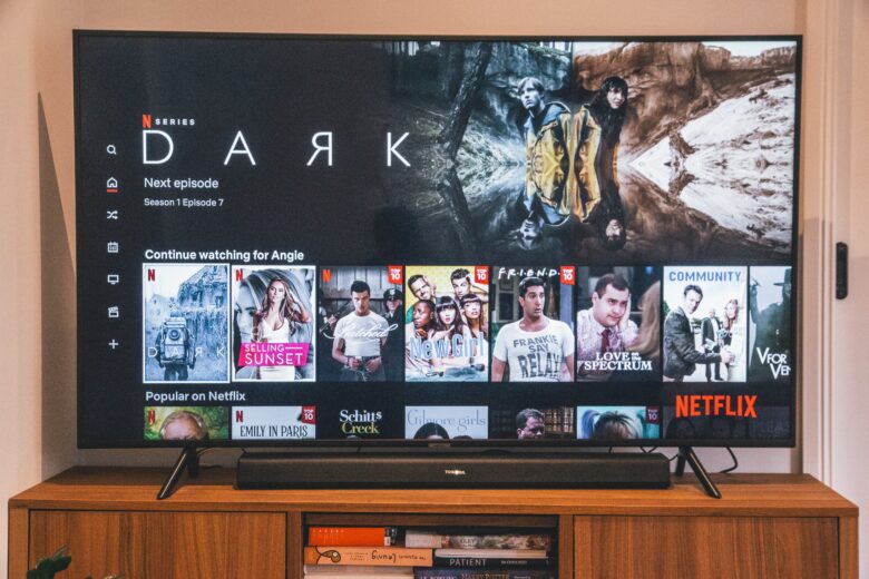
Remember that series that made you tie yourself into knots when trying to trace the connections between the characters and events? Well, Dark is definitely a hard nut to crack. Netflix did know about it, though. That’s why the official guide was created to help the fans understand the sequence of events and how everyone is connected to each other.
The website offers a filter to find characters. It was specifically built to shield the users from spoilers. So, you can choose any episode you’re watching right now and look at the interrelations in the scenario.
The sound effects and transition between pages offer an amazing user experience and re-create the same mood that follows you as you watch the series. The interactive map with families allows one to recollect the details of everyone’s biography and unscramble the plot. It is built using mostly WebGL to make the interactive interface and has received a 7.96 rating. It also has the Site Of the Day award.
Photon Experience

Source: awwwards.com
Photon Experience is a website that uses AI and… Well, it’s hard to understand what one needs to do with the interface and its very purpose. According to the website, it “is an interaction-based visual reasoning system from Neuro-Symbolic Lab.” For users, it’s mostly about interaction and breathtaking design with numerous animations.
One can also explore the abilities of the AI-powered tool. For instance, you can check how the imaginative part of its “brain” functions. The website can keep you glued to your screen for a while.
Tech stack used:
- Vue.js;
- Three.js;
- GSAP Animation;
- WebGL;
- Blender (3D);
- Node.js.
Takeaway
So, there you have it, some of the most impressive websites one can explore to make sure that the world of web development can do marvels if used by experts. Yet, the sky’s the limit for any craft.
Have you already thought about mastering some of the listed technologies? Imagine that you can develop a website competing with the mentioned Awwwards representatives or even outperforming them. That’s the goal worth pursuing, isn’t it?


