One thing about design is that most folks think it’s way easier than it actually is. But, if you’ve ever picked up a sketchbook or a graphic tablet and tried to designed something original, you’ve quickly come to realize how incredibly difficult it is.
And, one of the most difficult design challenges out there is creating a logo. A logo is much more than just a pretty picture or an interesting font – it’s the face of a company or brand, and it needs to be memorable, unique, and representative of what that company or brand is all about.
Creating a logo is more than just scribbling a thousand-times-seen image or copying some text from a free font library. You must understand the principles of design and how to apply them in order to create a truly great logo.
And, that’s exactly why we’re here today.
1. Sketch It Out First
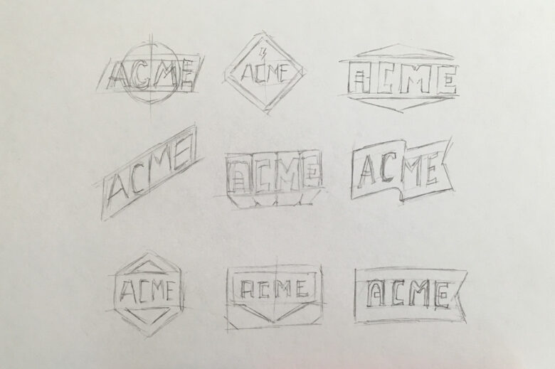
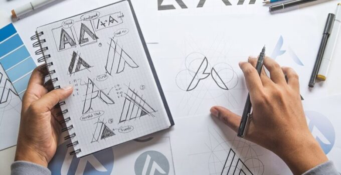
It all starts with a sketch. Any world-renowned designer will tell you this. So, grab a sketchbook and a pencil and get to scribbling. This is the most important part of the entire logo design process because it’s where you’ll come up with the initial idea for your logo.

Source: creativemarket.com
It might take hours and dozens of different sketches until something finally clicks, but trust us – the effort is worth it. Once you have a sketch that you’re happy with, you can begin to digitalize it and add the finishing touches.
2. Keep It Simple
First, let’s get one thing out of the way. Simplistic and minimalist design is not the same. If we’re clear on that, let’s move on.
Keeping your design neat and simple means avoiding unnecessary or convoluted details that might make your logo seem “busy.” A complicated logo is more difficult to remember and can be easily lost in a sea of other designs.
A well designed logo will be easy to remember and identify. So, when you’re starting the design process, ask yourself if each element you’re adding is truly necessary. If it’s not, get rid of it.
3. Use Typography Wisely
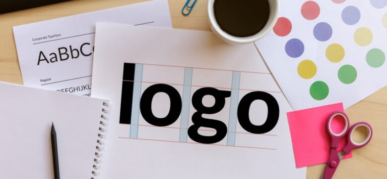
You’ve probably noticed an emerging trend of logotypes taking over more traditional images or symbols as logos. And, that’s because typography can be an incredibly powerful tool in logo design – when used correctly, of course.
A well-designed font can say a lot about a company or brand. It can be modern or classic, playful or serious. Now, be prepared for some hard and tedious work if you’re designing a typeface from scratch. It’ll take a while, but don’t give up. It’ll be worth it in the end.
Just remember to keep it simple (see rule number two). Overdoing it with different fonts and styles will only result in a confusing and unreadable logo.
4. Be Consistent

Source: thoughtfulgrowth.com
Listen carefully because we’re given some great advice here! A true staple of quality creation is consistency. This principle applies to every aspect of your work, but it’s especially important when it comes to logo design.
It should be easily recognizable, no matter where it’s seen – on a billboard, in a magazine ad, or even on a coffee mug. That’s why you need to make sure that the colors, fonts, and overall format of your design are always consistent.
5. Comprehend Color Theory
Would you consider buying fresh produce from a store with a black and navy logo? You’d probably hesitate, right?
Not only do navy and black don’t mix all that well, but psychology behind color can be a make-it or break-it factor when it comes to making a decision. The colors you use in your logo need to be carefully chosen and properly combined in order to create the desired effect.
If you’re not sure where to start, we suggest doing some research on color theory. It’s a vast and interesting topic that can teach you a lot about how colors can influence human emotions and behaviors.
6. Understand Negative Space
Don’t be scared of the negative space. Instead, use it to your advantage. We’ve already mentioned “busy design” and how you should avoid it at all cost.
Well, one of the best ways to achieve a clean and professional look is by using negative space – the area surrounding your logo’s subject. So, instead of filling up every bit of free space with some element or another, try leaving some room for breath. It’ll make your logo look more balanced and give it a certain edge.
7. Create a Unique Identity

Source: tribeofbrands.com
It kind of all boils down to this, according to Payless Promotions, if you want your logo to be truly successful, it needs to have a strong and unique identity.
Your goal should be to create something that’s not only pleasing to look at but also reflects the values of your company or brand.
The best way to achieve that is by putting your heart and soul into the design process and not giving up until you’re completely satisfied with the result. Easier said than done, right?
8. Think About Scalability
Often overlooked by amateurs but incredibly important aspect of logo design is scalability. You want your logo to look equally imposing printed on a mug and a 30×30 foot billboard. That’s why you need to make sure that it can be easily scaled up or down without losing any quality or more importantly – readability.
9. Make It Memorable
A logo that’s easily forgotten is not a good one. A great logo, on the other hand, is one that’s easily remembered.
How do you make sure your logo falls into the latter category? By keeping it simple (there’s that rule again!), unique, and consistent.
But, being memorable isn’t just about being easy to remember. It’s also about leaving a lasting impression. And that’s something you need to keep in mind when choosing colors, fonts, and overall structure of your design.
10. Polish, Polish, Polish!

Source: medium.com
Finally, a tip no one wants to hear, but is virally important non the less – never settle unless you’ve reached perfection.
And, sure, that might take a multiple final versions of your PSD document. But, trust us, it’ll be worth it in the end.
Polish your design until you’re left with nothing but the feeling of success and satisfaction.
Hold on to that feeling. It’ll last until your clients get back to you with the “I feel like it should POP more. Can we do that?” comment.
And, yes, they’ll type “we”, like they’re the ones hunching in front of a laptop for hours on end. It’s hard, we know.
Conclusion
So, there you have it. Ten basic but incredibly important tips on logo design.
Keep them in mind and you’ll be well on your way to becoming a master designer. Just don’t forget to have fun along the way!


